Tuesday, March 29, 2022
Podcast Question 3
Question 3
Me and my partner filmed a podcast answering the question on how our production skills developed throughout the project.
Wednesday, March 16, 2022
Movie Typography Ideas
Movie Typography Ideas
We decided it was time to work on the typography and stylistic choices of our film, so we gathered popular films pertaining to our genre for inspiration.
Avenir Medium Oblique

John wick was my first selection, as we took heavy inspiration from the John Wick franchise. John Wicks typography is nothing out of the ordinary, and doesn't make a huge impact. Its simple and straight to the point, with a subtle dirty effect over the text. The typography is very bold and takes over almost a third of the poster, making a statement on what the film entails. We heavily considered this option, but we will keep looking for better choices.
Fiorello Condensed

The font for The Batman was another heavy consideration for us, it uses a lot of the same features as the John wick font. Its bold and upfront, giving the audience a menacing feel. Depending on how we want to develop our vigilante, this is a good choice for us to use. It may be too bold and sharp for us, but I like the way it looks on screen, which is why we considered it so much.
Spectre

The spectre font is completely different from the previous two. It is much more small and smooth, not to overbearing, and fits our film well. It has a nice cut up effect to it, and is very unique compared to any other fonts. For our last two fonts we chose a very big and bold font that is almost intimidating, but we chose spectre incase we want to go for a different route.
In the end, I ended up going with the spectre font. After considering the others, I found that a more sleek and smooth font would be better for our film. The other two fonts were very powerful and strong, while we want a more controlled and staggered font. I really liked the shakey effect they used, which was overall the deciding factor to my decision
Focus Group Feedback
Focus Group Feedback
After filming, I thought I should splice together all of the footage, and show it to a couple classmates, to collect any criticisms and compliments they had for us.
Brian had nothing but compliments surprisingly, saying "I like the camera angles and how we never get to see the antagonists face". He also went on to say," The camera angles and shots are very high quality".
Daniel said," I like the camera work a lot, but I think the lighting could have been much better". This is a complaint we expected, and one that we plan to fix. Daniel also said," The acting is almost funny and not too serious, I like it". This is something that I don't know if its compliment or not, but we'll take it.
Ryan, one of the actors in the film said," The film is pretty interesting and intriguing. I like the angles and the scenes. I just really think better lighting would make the scenes so much better, so if you get the chance you should edit it."
Noah, another actor in the film said," I really like the acting and the script that they have. I like the scenes, but I think the mob boss is not as intimidating as he should be, he looks small."
After reading over all the feedback, I'm happy with what they had to say, and will be sure to use their criticisms to improve our film. Im not surprised with what the focus group had to say, and I honestly expected more criticisms than what we got. I found it interesting how we have some conflicting statements, and I'm happy that the film gathered different ideas and perspectives. For the complaints about the lighting, we do plan on trying to fix it in post, trying out different color grades and filters, to see if it will solve our problem. For complaints on acting and the roles given, I don't think this is a major problem, as we all did our best that we could. Im happy with the compliments on the camera angles, and hopefully its something we can build off of.
Tuesday, March 15, 2022
Mobster Costume design
Mobster Costume Design
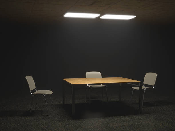
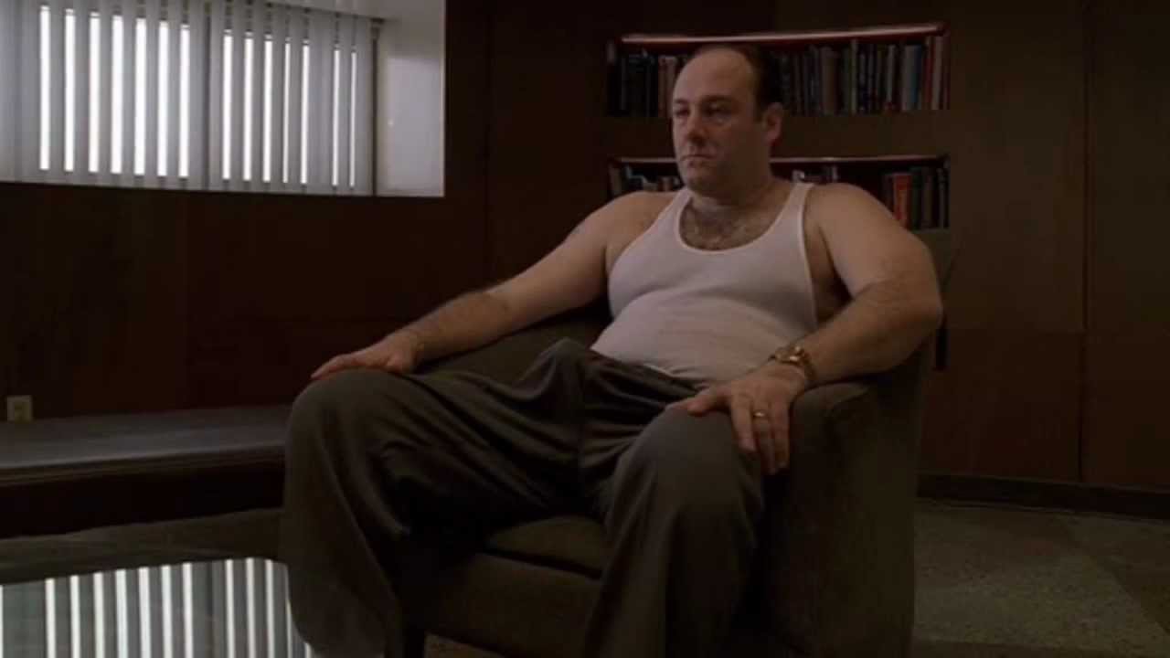
While we needed the correct actors and script to fit the role, making them look the part was a huge aspect. We started off by studying mob-related films and TV shows, to gather inspiration for our look. We took huge inspiration from shows like the sopranos, and movies like the godfather, scarface, and many more.
This image, in particular, was what we were basing our mobster's looks off of, which is why it was important for us to research popular films pertaining to our genre.
Clothing
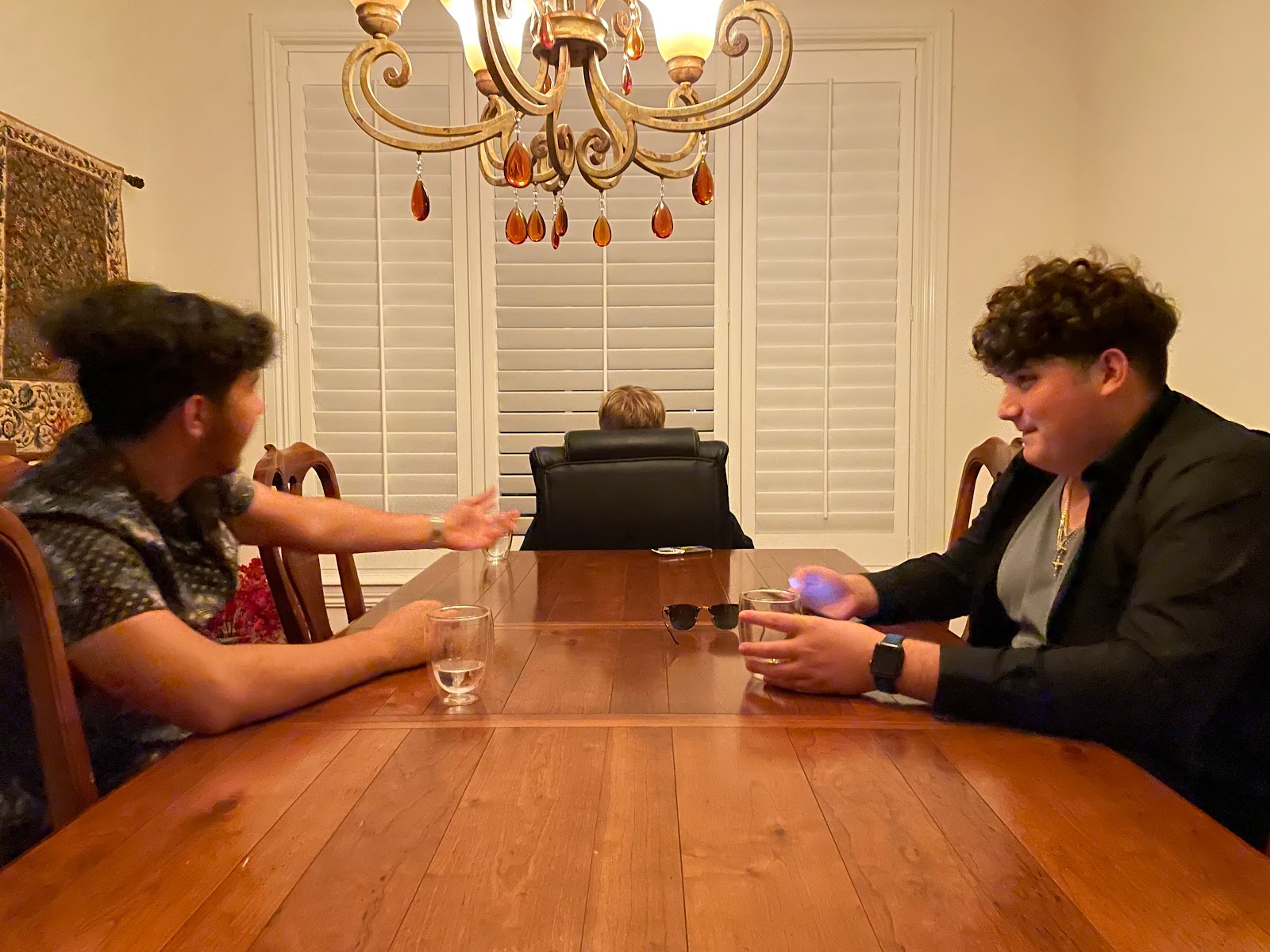
For clothing, we decided on each character wearing a black button-down shirt, to match the more serious tone of the meeting they were having. We wanted the mob boss to be in a full black outfit, with little to no accessories, to set him apart from the rest of the characters. Also, instead of just everyone wearing black, we decided on each mobster to very clearly have a personality of their own, which was shown in the clothing choices.
For Noah (right), we wanted him to be the more scruffy, typical mobster, type look. To achieve this we made sure his shirt was unbuttoned, showing his chest and undershirt. While for Ryan (left) we gave him a floral buttoned-down shirt, to come off as more serious and groomed.
Accessories
For the accessories, we wanted to again encapsulate the mobster look, which is why we decided on heavy jewelry and glasses. With Noah's chain very clearly showing on his neck, we wanted to show that these mobsters were very well off, and have been doing this for a very long time. Showing the wealth that these mobsters had is another way to intimidate the audience, showing a sign of power.
As for the glasses, we wanted Ryan, again, to have a more serious look, so giving him glasses to wear was only right. I think the glasses he wears do a great job at this, and they truly separate the two mobsters apart.
Feedback from Day 1 footage
Feedback from day 1 footage
After finishing our first day of filming our movie, I thought I should collect some feedback from those around me about our footage. I asked both my parents as well as my siblings about the film to see what we should correct next time around, and what we did well.
Oddly enough, both of my parents had quite similar responses. The main criticism they both shared was the poor lighting. My mother said the lighting was too "yellow" and it looked out of place, she also did not like the massive chandelier taking over most of the scenes. My dad on the other hand criticized the brightness of the film, saying "it doesn't match the genre". He told me that we should have made the lighting much dimmer, and although it wasn't something we could have fixed at the time, we will be sure to add some color grading in post-production to set the mood.
My mom was very happy with the storyline and found that our lines really set the intimidation factor for the film. She thought it was good how the mobsters really showed fear in each of their lines, as it tells the audience how important the boss is. My dad also liked the script as well as the acting, saying that " the acting sets the tone".
Overall I am not surprised with the many criticisms we received, as it critiqued my film very heavily beforehand, and knowing my family, I knew what they would like and dislike. However, I
am surprised with the positives, as I didn't expect the aspects they found good to be noticeable.
am surprised with the positives, as I didn't expect the aspects they found good to be noticeable.
1st Day of Filming
1st Day of Filming
Finally, after days of unexpected plans, dropped cast members, and procrastination, we had our first day of filming. On March 9th, my group met up at around 7:30pm and filmed all of our mobster and mob boss scenes.
After all of us arrived at our filming site (Aidan's house), we all met up in the dining room and began preparing for filming. We set up our chairs and discussed where we should all sit, who had what roles, and what lines we needed to read.
Each actor was dressed in a black button-down, with black pants, with each actor having different props. We decided Noah (right) would be a much scruffier and disorganized mobster, leaving his shirt unbuttoned, exposing his wife-beater, a gold chain, and messy hair. For Ryan (left) we went for the exact opposite, a nice collared shirt fully buttoned, a nice watch, and glasses. I, the mob boss (center) was much more well-groomed, and plain, as we didn't want to reveal too much information about him.
After figuring out each actor's positions, and we sorted out all of the outfits and props, we started working on camera angles and lighting. For lighting, it was extremely difficult for us to figure out how dim we wanted it, what light sources to use, and how it worked with the angles of the camera. We brought out different lamps, coverings, and even unscrewed a few light bulbs, but ended up settling on the base chandelier lighting. Although we wanted a much dimmer, and darker effect, we found it was best to just stick to what we had, as it gave the best lighting out of all the options.
For camera angles, we had my partner (Aidan) move around at different positions for each scene, as we meticulously positioned the angle for each scene. We knew our main concern was not showing the mob boss's identity, so we prioritized making the mob boss seem as mysterious and intimidating as possible. We positioned the mob boss at the end of the table, in a different chair than everyone else, to make sure the audience knew the importance of his role.
Overall, our first day of filming was a success, even considering all of the troubles we encountered. Despite audio, lighting, and camera difficulties, we filmed all of the scenes we needed and finished filming on time.
Monday, March 14, 2022
Timeline Update
Timeline Update
Now that my group has filmed a majority of our movie, I thought I should update our previous film timeline, as the dates previously mentioned are completely different from what actually happened. Due to timing issues, unexpected plans/events coming up, as well as our own laziness, the filming dates were pushed back to March 9th and March 10th. Also, we encountered multiple issues with our cast members backing out right before production, so we took almost 2 weeks to find new actors.
On Wednesday, March 9th, we finally met up with our mobsters and filmed every mob scene. We met up around 7:00pm and finished production at around 10-10:30pm. Although all the actors were quite upset with the late finish, we still banged out half of our film, and only needed to film the detective scenes.
On Thursday, March 10th, my group finished up the later half of the film with the detective scenes. Casting for these scenes was much more difficult as we couldn't find someone that fit the role we were looking for perfectly. But we found one of our friends that matched it the best, and we finished up all of the filming. We started a little earlier at about 6:30, so we could prepare our scenes better, giving us more than enough time to film, we finished at around 8:30. There wasn't much of a challenge filming these scenes, but all of us being close friends didn't help it go by any faster.
Next is the editing portion of the project, which we will complete on March 15th. My partner Aidan will do most of the editing as he is more skilled at it, and has done it for our past projects, but I will be right by his side for moral support.
Thankfully we have already finished all of our filming, and hopefully, nothing comes up to delay our scheduled editing times.
Thursday, March 10, 2022
Set design / Mis-En-Scene
Set Design / Mis-En-Scene
Mis-En-Scene is important for our film as we need the set and actors to look the part for the roles we gave them.
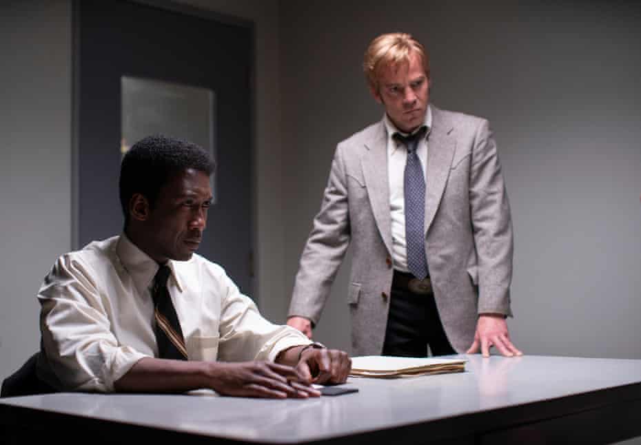
For set design we decided to go with a dining room table and chandelier for the mob setting. We didn't have many resources to make huge changes to our set, so we decided this would fit the mob meeting the best. With dimmed lighting and a simple background, the dining room was easily our first choice for the set. As for the police station set, we found it best to film in a dimly lit room with paperwork scattered on the tables, as we couldn't find a suitable location for our detective scenes.

For costume design, we needed to take inspiration from other mob films that resembled our plot and theme.
The mobsters were much easier to design as we had tons of examples and movies to go off of. We decided the mobster would be wearing unbuttoned shirts dress shirts, with wife beaters underneath, while wearing accessories such as gold watches, chains, and earrings. We wanted the mobsters to look much less professional than the mob boss, to set the tone and difference between the two. The wife beaters gave the perfect look of a kind of New Jersey mobster, while still not being to trashy.
For the mob boss, we decided they would be wearing a simple black dress shirt, and dress pants. As we knew we wouldn't be showing his face, we decided to go for a much more basic yet intimidating look. Dressed in all black, it was easy to see the importance, as well as the ill intentions behind them. Costume design for the main antagonist is a very important process, which is why we wanted a more plain and mysterious look, not revealing too much about them.

For the detectives costume design, we wanted them to be much more professional and well dressed, to show their level of importance and motives. Simply wearing business casual attire, with a badge clipped on was enough, as we didn't want to complicate the design. Taking inspiration from multiple shows and movies, we noticed we needed to show a working look, maybe having one of them with their tie undone and shirt untucked, could show they were hard at work, and not taking a break.

Wednesday, March 2, 2022
Color Grading
Color Grading
Color grading is something that we could easily utilize, as it fits our genre and film style. We are making a detective/crime action movie, so using a grey-styled color grading over our film could help us achieve the look we are going for. Color grading is a widely used technique used in many films just like ours, so it was quite easy to find inspiration.
The best example of good color grading is Twilight, in this case, the entire movie was given a grey/green color grade. This effect gave the film an extremely dark and shadowy effect, which is perfect for a movie about vampires. Without this color grade, I think the film wouldn't have been nearly as good, as it completely changed the way I viewed the movie. It made the characters fit their roles much better, giving them a more pale and vampire look. Using a color grade in our case could give us the old-time, detective look that we are striving to achieve.
Subscribe to:
Comments (Atom)
-
Film Conventions Genre of Choice: Action / Adventure Most, if not all action films have a very similar plotline and structure to them. Sim...
-
Film Opening Storyline Establishing Shot: The film begins with a wide shot of a dimly lit room, behind the throne of the mob boss. There ar...
-
1. How many titles are displayed during the opening sequences of the film? The main title of the movie is displayed once at the very beginn...


